Washington College in Kent County has a storied history. It’s the country’s 10th-oldest college and was the first to be chartered after the United States gained independence.
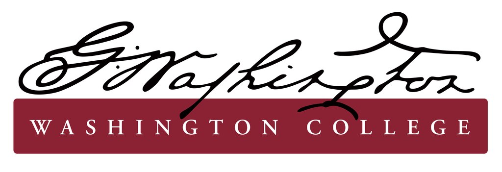
It was supported by George Washington, who allowed the school to use his name and who contributed financially toward its founding. Since 2013, the school’s official logo featured Washington’s signature.
But now the “highly stylized” version of Washington’s signature has been replaced — at least in part because some schools don’t teach cursive anymore, according to Brian Speer, the college’s vice president for marketing and communication.
“Because cursive writing is no longer taught universally in K-12 education, the script — especially this highly stylized version — was difficult to read and not immediately recognizable for many prospective students,” Speer wrote in a post explaining the branding changes.
Speer wrote that the old logo was “counterproductive when it came to name recognition and identity.” Washington’s signature will still be used as a “complementary visual” to some college materials, he added.

Which, from this reporter’s perspective, is a fair critique. The “G” in our first president’s signature looks kind of like the infamous “D” in the Disney logo that children have often confused for a backward G.
And all due respect to Mr. Washington, but the “W” in his signature looks kind of like an “M” or an “N.” The “S” looks maybe a bit like an “L”? And the “T” looks like an “F.”
So who can blame the school for updating their logo, when it could be read as “D Nalhingfon” instead of “G. Washington”?
While some alumni took to Facebook to express disappointment with the change, one commenter acknowledged that the change and evolution of a college’s logo is “inevitable.” Another, who said he used to serve on the Chestertown Town Council, called the new logo “crisp” and said he loved the new look.
The old logo also did not scale well, Speer wrote, making it even more difficult to recognize and even “illegible” on some marketing material, making it ineffective.
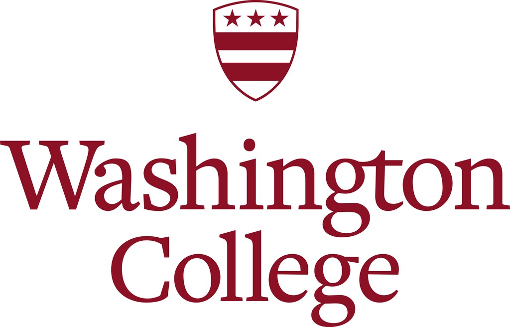
The college’s new logo keeps its colors, but replaces Washington’s signature with the Washington family crest, a shield with three red stars and two red stripes. It replaces the stylized “G. Washington” with “Washington College” in a serif font.

Speer wrote that the crest has been part of the college’s seal “as far back as the earliest visual records held” in the college’s archives.
As part of a wider rebranding, Washington College also redesigned its seal and adopted a new Latin motto.
The college’s previous Latin motto translated to “The Short Seal of Washington College in Maryland,” and the new one, “Scientia, Veritas, Civitas,” translates roughly to “Knowledge, Truth, Citizenship,” Speer wrote.
In an email, Speer said the school began using the new branding over the summer and the transition will continue for about a year so it will have “minimal” financial impact. He said there have not been any additional costs associated with the new logo so far, but the college is looking at updates to campus signage “that can be handled within our normal budget.”
He said the school is trying to make the transition as sustainable as possible, so instead of taking back already produced materials and recycling or throwing them away “en masse,” officials at the school are letting materials run out and turn over on their own timeline.
Earlier this year, Washington College ranked in the top 100 in National Liberal Arts Colleges and in Best Value Schools in rankings compiled by U.S. News & World Report. It was also included in the Princeton Review’s “Best Colleges” list for 2025.


Comments
Welcome to The Banner's subscriber-only commenting community. Please review our community guidelines.