Finally, after much clamoring and years of waiting, the Ravens have a new uniform combination.
The team’s new “Purple Rising” alternate helmet, announced Monday and paired with its “Color Rush” uniforms, will be the 12th look introduced in franchise history, according to the Ravens Uniform Tracker account on X.
So where does it stand in the Ravens’ sartorial pecking order? We all know which condiment-inspired combo is last, but personal favorites vary from fan to fan, and also from journalist to journalist. Here’s how the voting from our Baltimore Banner panel — reporters Jonas Shaffer and Giana Han, “Banner Ravens Podcast” co-host Paul Mancano, columnist Kyle Goon, and editors Chris Korman and Brandon Weigel — shook out. First-place votes were worth 12 points, second-place votes were worth 11 points, and so on.
12. Purple jersey, gold pants (10 points)
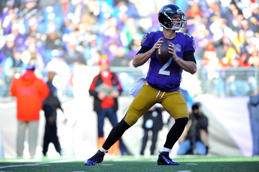
Shaffer: Bury these pants in the pain box from “Dune.” They’ve been worn only once, and the world is better for it.
Han: Art But Make It Sports could probably find an English lord from the 1800s sporting these.
Mancano: If the designer was going for a court jester vibe, they absolutely nailed it.
Read More
Goon: A great, classic top with pants that look like Dijon mustard. No, thanks.
Korman: Definitely need to give these another go, see if you can rinse the Jimmy Clausen off of them.
Weigel: This combo evokes a peanut-butter-and-jelly sandwich. No.
11. ‘Color Rush’ with ‘Purple Rising’ helmet (22)
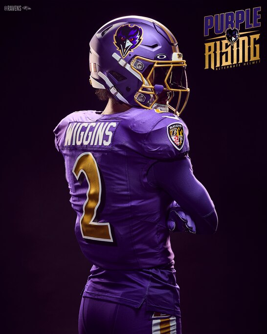
Shaffer: The uniform: good. The piping on the helmet: good. The logo: good. So why does it feel like less than the sum of its parts? Maybe it’ll grow on me.
Mancano: Does anybody know what “Purple Rising” means? When will it reach its apex?
Goon: The helmet doesn’t do it for me.
Korman: I’m not in the business of giving a combo any love until I’ve seen that it is willing to earn it on the field.
Weigel: I recoiled as soon as I saw the helmet on social media. The new design just looks so bootleg. Is it too late to pull this off the table?
10. White jersey, purple pants (30)
Shaffer: Not the Ravens’ best look with purple pants, but not the worst, either.
Han: Points for being kind of funny. They remind me of a guy who tries to get creative with his outfit but isn’t quite there.
Mancano: Are the pants grape-flavored?
Goon: On a sunny day, a home team wearing white just gleams on the field.
Weigel: Purple pants just don’t do it for me, but this is the best combination they’re used in.
9. White jersey, black pants (33)
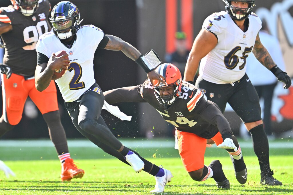
Shaffer: The Ravens went 4-0 in this look last year. Before that, they were 35-54. I blame the dullness of the uniforms.
Han: It’s just too ... black and white.
Goon: A solid option, but just a little basic.
Weigel: The Harbaugh Bowl uni, though without the pronounced black collar. A stylish look, in my opinion.
8. Black jersey, white pants (35)
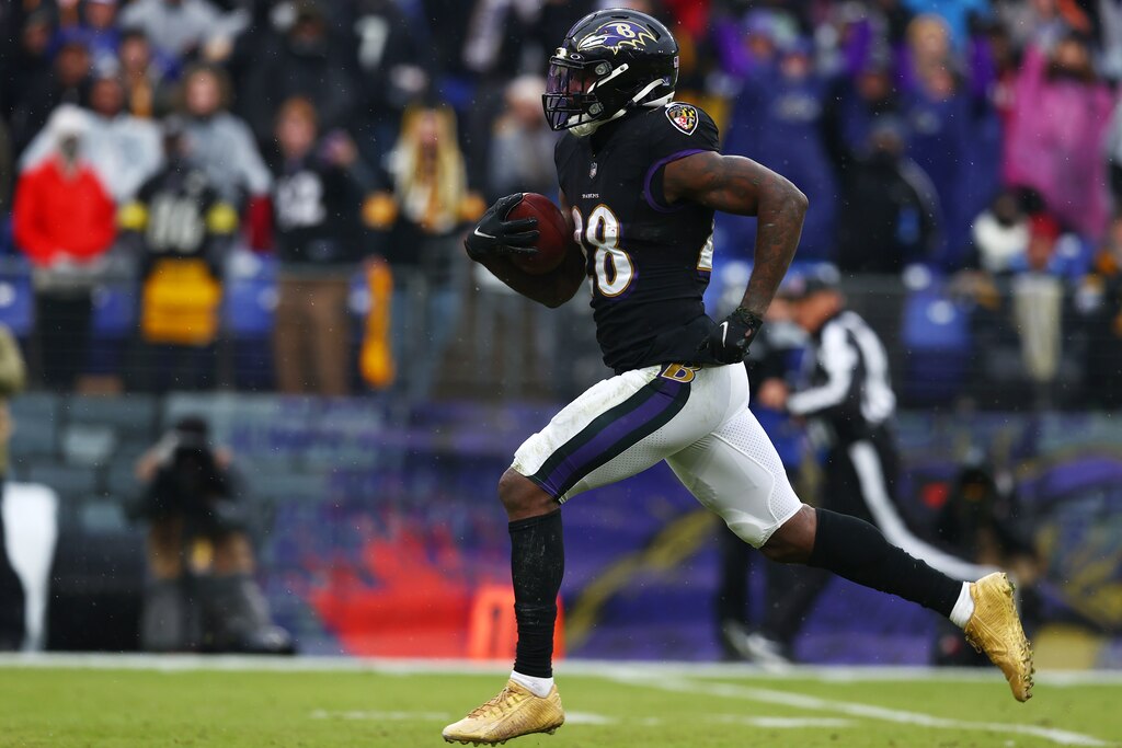
Goon: Not sure I’ve actually seen this combo much, but I prefer more purple in the mix.
Weigel: This alternate isn’t as gaudy as some of the others, but I also prefer some of the more classic looks.
7. Black jersey, purple pants (38)

Shaffer: If you want my vote this fall, run on a platform of getting the Ravens to wear this more often. Just five times in franchise history, apparently? Unacceptable.
Han: While the purple pants feel silly with white tops, the darker shade of black tones down the “pop” and makes it look intense rather than fun and flirty.
Goon: My brain wants this combo to be flipped when I see it.
Weigel: I love the all-blacks. Swapping in the purple pants feels like creating an alternate for the sake of having an alternate. Very blah.
6. ‘Color Rush’ (40)
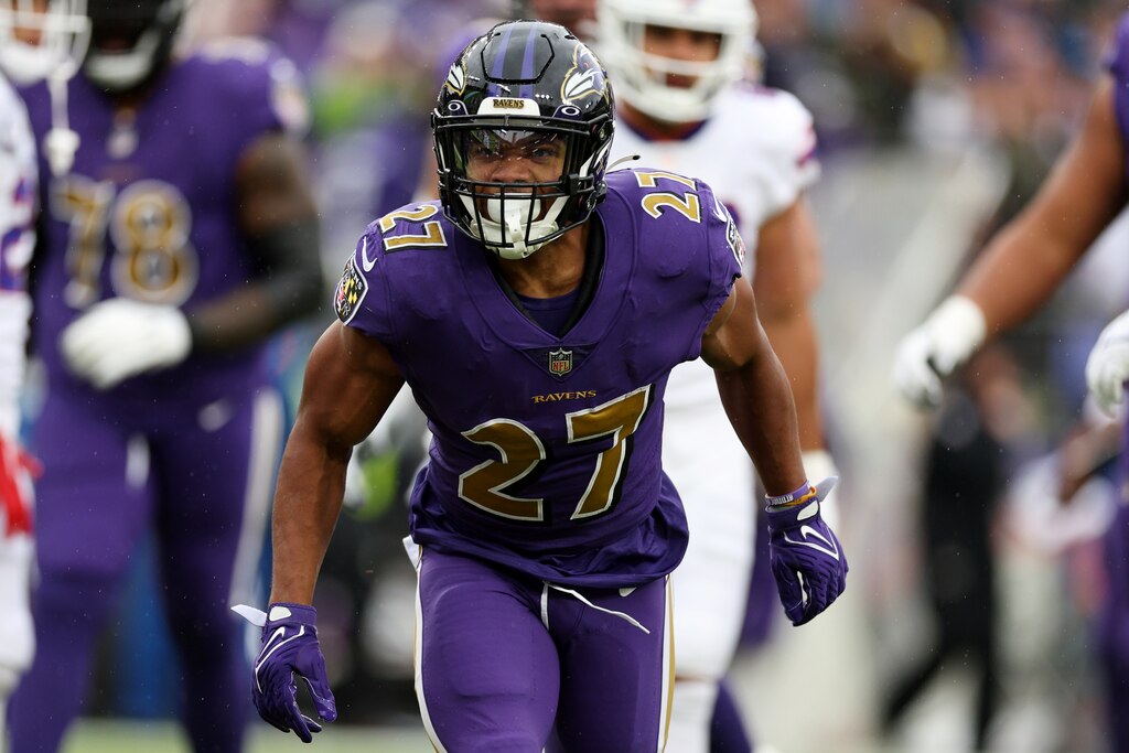
Shaffer: The white-and-gold trim along the pants evokes the state flag, and that’s a good thing. Because it’s a great state flag.
Mancano: I don’t know where the colors are rushing off to, but I sure wish they’d slow down.
Goon: With black helmets, this is a reasonable change-of-pace fit.
Korman: Clearly among the better “Color Rush” concepts. Different enough without going too far.
Weigel: The gold in the Ravens’ uniform is best served in small doses. This is not that.
5. Purple jersey, purple pants (41 points, one first-place vote)

Shaffer: Purple was a revered color in antiquity, but even the emperors who married their cousins had the good sense to not wear all-purple everything.
Mancano: Jonas, the emperor you’re thinking of had no clothes.
Goon: The concept is OK, but the trim in this combo hasn’t been great in the past.
Korman: Need these with the purple helmet. Go the whole Grimace.
Weigel: It was bold for the Ravens to make purple one of their primary colors, and they make it work. But this — this is way too much purple.
4. White jersey, white pants (46)
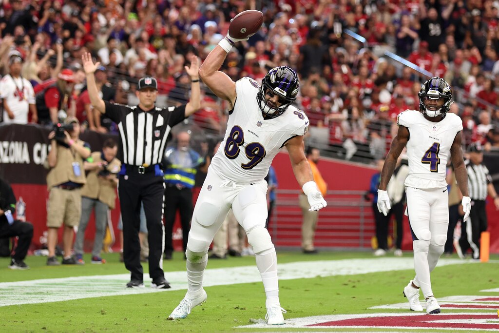
Shaffer: My thoughts and prayers go out to the Ravens’ equipment managers after games with all-white uniforms, but it’s scientifically proven that players move 2% faster in this look.
Han: There’s something to be said for a look that chronicles every hit and fall of a game in mud streaks and grass stains.
Mancano: This is the most unrealistic and scientifically inaccurate uniform combination. The common raven (Corvus corax) is an entirely black bird with no white accents to be found. I cannot, in good conscience, condone this choice.
Goon: Just kind of boring.
Korman: So clean.
Weigel: Good vibes are associated with the Super Bowl XXXV fit. Trent Dilfer to Brandon Stokley. Ray Lewis wreaking havoc. Jermaine Lewis streaking down the sideline. You love to see it.
3. Purple jersey, white pants (51 points, two first-place votes)
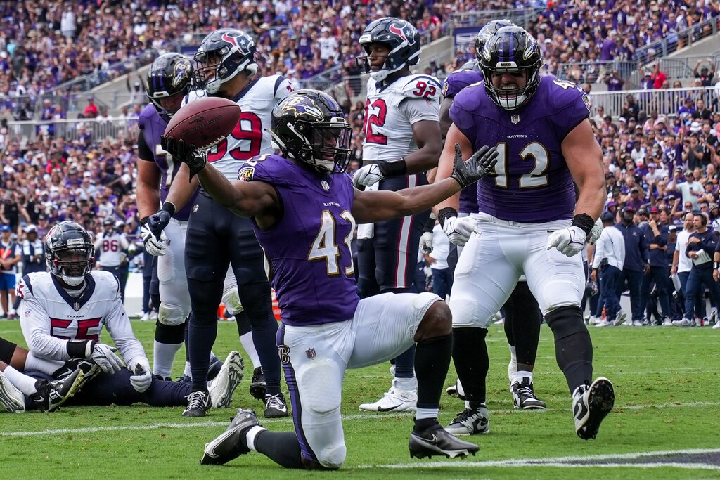
Shaffer: A classic. Just enough purple, and the white pants make everything pop.
Goon: Sue me. I love a classic. When I picture the Ravens, this is what they’re wearing.
Korman: Let me go immediately on the record with my hottest take: The white pants should be used only with white jerseys.
Weigel: I’m a sucker for the classics. This has been the Ravens’ primary home uniform since 1997, and it’s a good mix of the colors that make up the team’s color scheme. Striking yet refined.
2. Purple jersey, black pants (56)
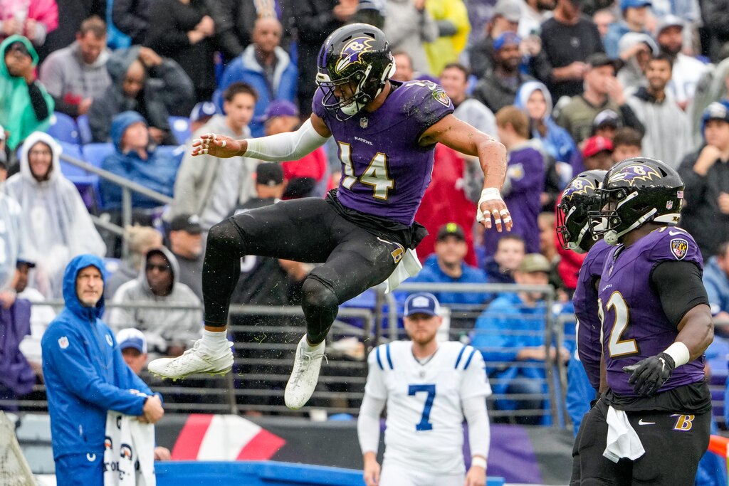
Shaffer: The Ravens’ first loss last season came in this look. So did their final loss. It’s still a good option, especially when accented with black undershirts. But the inverse combo (black jersey and purple pants) is superior.
Han: When I picture the Ravens, I picture purple jerseys followed by black pants. Although white and gold are part of their color scheme, it’s the purple and black that dominate for me.
Goon: Slightly more edge to the standard fit. Pretty much just as good.
Weigel: The Ravens had black pants with a white stripe for their debut season in 1996, but shelved them the next season. Plain black pants didn’t become part of their repertoire until 2004. It’s been a regular option since then and feels more established than some of the other alternates. I’m a fan.
1. Black jersey, black pants (66 points, three first-place votes)
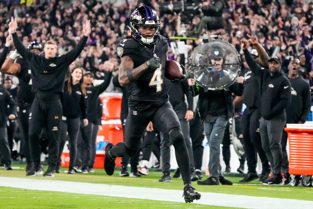
Shaffer: Good luck finding a Raven who’s looked bad in this getup. The all-blacks do not discriminate against beer-bellied linemen or lanky kickers or afternoon kickoffs. Can you imagine Derrick Henry in these at M&T Bank Stadium?
Han: These go hard. They’re so intense, with or without the added effect from the blackout atmosphere. They play right into the dark and dangerous themes the Ravens go with for their in-stadium graphics and external marketing.
Goon: Once in a while for prime time, this hits. It’s fun to see the defense swarm like a black hole.
Korman: Apparently I prefer combos in which the jersey and pants are the same color? I never realized this and have no idea what it means.
Weigel: When these are out, it’s usually a prime-time game and “The Bank” is rocking. These just look menacing, which kind of fits with the whole “play like a Raven” thing. Bonus points for being the uni that looks most like an actual raven.


Comments
Welcome to The Banner's subscriber-only commenting community. Please review our community guidelines.